REVIEW · PARIS
Paris: Color analysis
Book on GetYourGuide →Operated by Christelle Macia · Bookable on GetYourGuide
Color draping is weirdly powerful. In this Paris session, you get personalized colorimetry using fabric draping, not the old template labels. I especially like the way you can see your face respond in real time as different tones sit next to you.
Two things I really love: the hands-on guidance (clothing, accessories, makeup, and hair shades) and the fact that you leave with tools you can actually use when you shop. The one drawback to consider is practical: it’s on the 5th floor without elevator, and you’re asked to come makeup-free.
In This Review
- Key takeaways before you go
- Paris Color Analysis in Canal Saint Martin: Why This One Works
- Meet Christelle Macia and the Draping Method
- The 1-Hour Breakdown: What Happens During Your Color Session
- Step 1: Color analysis with fabric draping
- Step 2: Color advice for your real life
- What You Learn: Warm vs Cold, Bright vs Soft, Dark vs Bright
- Warm vs. cold: the undertone decision
- Bright vs. soft: your clarity level
- Dark vs. bright: depth and light balance
- Your Color Book and Pocket Chart: The Shopping Tool That Matters
- Makeup and Hair Advice You Can Actually Test
- Where the Workshop Fits in Your Paris Day
- Logistics That Can Save You Stress (5th Floor, No Elevator)
- Is This Good Value at $165 for a 1-Hour Session?
- Who Should Book This Color Analysis Session in Paris
- Should You Book This Paris Color Analysis?
- FAQ
- FAQ
- How long is the Paris color analysis session?
- Is it a private session?
- What method does the stylist use to find your colors?
- What should I bring to the workshop?
- What do I receive after the session?
- Where is the meeting point?
- What should I know about the building?
Key takeaways before you go
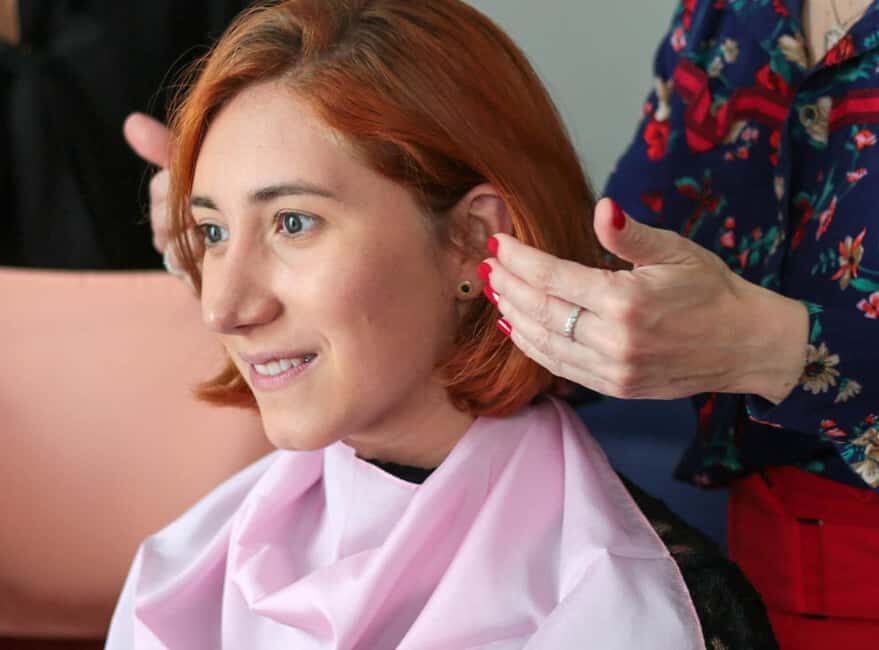
- Draping méthod over “seasons”: you’re guided by how the fabric looks on your skin, not by a box.
- Warm/cold + bright/soft/dark framework: clear language you can use while shopping.
- You leave with two documents: a color book and a pocket chart for quick decisions.
- Makeup and hair advice are part of the same session, so you’re not stuck guessing later.
- Small, private group feel: the session is interactive and practical.
Paris Color Analysis in Canal Saint Martin: Why This One Works
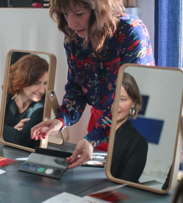
Paris loves style, but it can also make you doubt your own instincts. You might buy a color that looks fine in the store… then it washes you out in daylight, or it clashes with your skin tone in photos. This is where a personal color session earns its keep.
The setting helps, too. The workshop is in the Canal Saint Martin area, close to fashion boutiques, cafés, and restaurants, so the whole experience feels grounded in real shopping life rather than theory. Inside, you’ll work in a quiet, bright space where the goal is simple: match the colors to you, so you can build a wardrobe that looks healthier and more intentional.
You’ll be guided by Christelle Macia, a French, English-speaking stylist who uses draping to personalize the results. And that “no generic label” approach matters. If you’ve ever felt that classic 4-season color systems never quite fit you, this method is designed to help you move past that frustration.
You can also read our reviews of more tours and experiences in Paris.


Meet Christelle Macia and the Draping Method
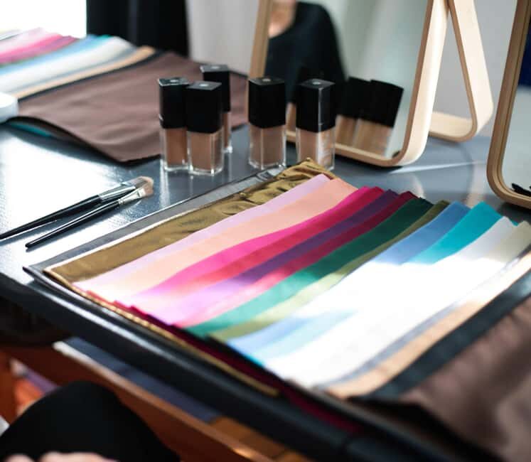
This session is built around a process called color draping (draping méthod). Instead of starting with your eye color and hair color and then guessing what you should wear, you start with fabric.
Here’s the core idea: different cloth tones sit next to your face and change how your skin, eyes, and overall complexion look. The draping approach is meant to reveal which shades create a boost—when your features look clearer, fresher, and more harmonious.
Christelle’s mission is very practical: to make you concretely autonomous in choosing your colors. That means the goal isn’t just to give you a label and send you away. The goal is to help you become confident enough to pick colors without second-guessing.
A final detail that I like: the session avoids the rigid four-seasons categorization. She uses draping for more personalization, including for people who don’t fit neatly into standard boxes. In plain terms, you’re less likely to leave with a result that feels generic or frustrating.
The 1-Hour Breakdown: What Happens During Your Color Session
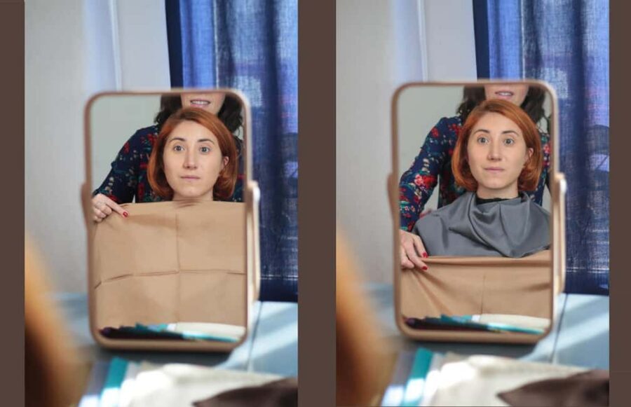
You’re booked for a one-hour experience, so the pace is focused. The structure is essentially two steps: first identify your best ranges, then translate that into specific wardrobe, makeup, and hair choices you can use right away.
Step 1: Color analysis with fabric draping
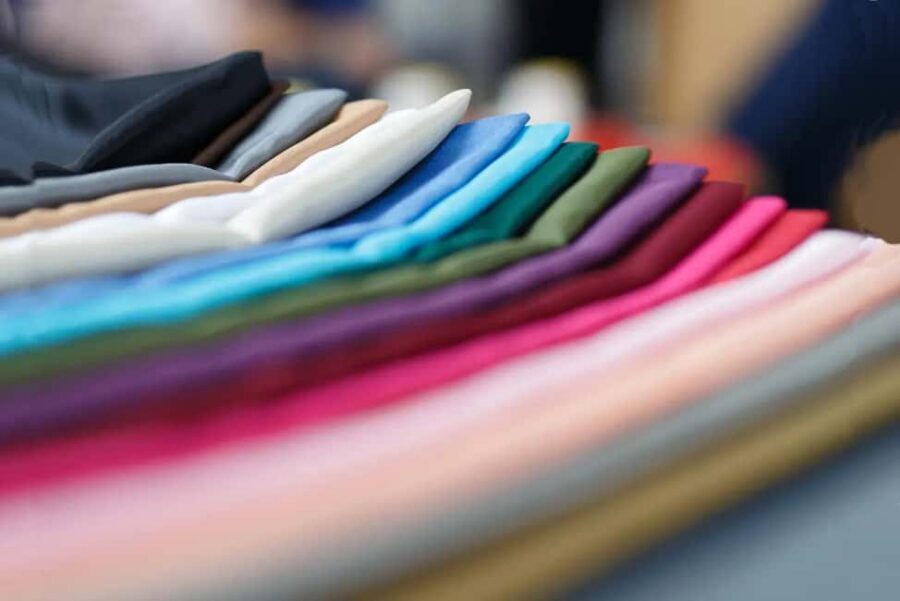
You’ll go through a series of fabric colors and compare how each one affects you. The conversation tends to follow three key axes of meaning:
- Warm vs. cold: Do golden/peachy tones make your complexion look smoother and more lively, or do cooler tones (more neutral-to-rosy directions) create that effect?
- Bright vs. soft: Are clearer, more vivid shades the ones that sharpen your features, or do muted, gentle tones look more flattering?
- Dark vs. bright: You’ll also assess whether deeper tones add depth and definition—or whether lighter, clearer shades are more flattering.
The aim isn’t to memorize jargon. It’s to help you feel what your face responds to, so you can make quick decisions later.
Step 2: Color advice for your real life
Once the draping shows your ranges, Christelle turns the results into actionable guidance. This is where your session stops being abstract and becomes usable.
You get advice for:
- upper-body clothing and accessories (so you can start applying it to the clothes you see most, like tops, jackets, scarves, and jewelry-friendly tones)
- makeup colors, including shades that support your coloring rather than fight it
- hair color choices, including what tones tend to work best for you
And importantly: you’re not just told what to avoid. You’re taught how to choose what works, with confidence. If you’ve ever tried to “guess” color rules from random online advice, this is the opposite: it’s tailored and immediate.


What You Learn: Warm vs Cold, Bright vs Soft, Dark vs Bright
The beauty of this method is how quickly it gives you a language you can use in stores.
Instead of only hearing a category name, you learn what kind of contrast helps you most. Here’s what each axis usually translates into when you’re shopping:
Warm vs. cold: the undertone decision
Warm-toned palettes tend to look more harmonious when your skin reads better with golden, peachy, or soft earthy vibes. Cold-toned palettes tend to flatter when your complexion responds better to cooler, clean, slightly rosy directions.
If you’re the kind of person who looks fine in one store but dull in another, this part can feel like a revelation, because undertone is often the hidden culprit.
Bright vs. soft: your clarity level
Bright palettes generally add definition and energy. Soft palettes can look more blended and gentle, often making the overall face look smoother rather than sharper.
This axis is especially helpful if you own makeup and find it either looks too harsh or not “alive” enough. Matching brightness level can change that fast.
Dark vs. bright: depth and light balance
This is about the overall lightness vs depth that suits you. Some people look best with deeper tones that frame their features. Others look better with lighter or more lifted shades that brighten the face.
Even if you don’t change your haircut or style, getting this right can noticeably change how “put together” you look in photos.
Your Color Book and Pocket Chart: The Shopping Tool That Matters
One of the smartest parts of this experience is what you take home.
You leave with:
- your color book, which summarizes your colorimetry results and includes your advice
- your pocket color chart, designed so you can carry it while shopping and pick colors quickly for clothing, accessories, and makeup
This is where the value shows. A lot of color advice is only useful if you follow it for years. Having a documented reference means you can recreate your decisions later. It turns color analysis from a fun session into a practical system.
In particular, the pocket chart helps when you’re standing in front of racks in changing lighting. You can check quickly rather than relying on memory or trusting labels that might not reflect the real tone.
And yes, the results are meant to help you with a healthier glow—so the goal is not just style. It’s looking better in your own reflection.
Makeup and Hair Advice You Can Actually Test
Color analysis only counts if you can apply it. That’s why this session includes makeup color advice and hair-color guidance.
In sessions like this, you often learn that makeup isn’t just about the brand or the finish—it’s about whether the pigment sits correctly against your coloring. When the makeup matches your brightness and undertone, your face tends to look more unified instead of separately “painted.”
A couple of people also highlighted that the makeup put on during the session impressed them. The practical takeaway for you: use the session as a live testing ground. When you see your face with the recommended tones, you stop wondering and start remembering what works.
Hair advice is another big one. Hair color can overpower your whole look, so knowing which direction fits you—cooler, warmer, darker, brighter—saves you from expensive trials that don’t match your real coloring.
If you like making changes slowly, this session helps you pick the right starting points for both makeup and hair, so you can build from there instead of randomly sampling.
Where the Workshop Fits in Your Paris Day
This is not a museum detour. It’s more like a quick style appointment that pairs perfectly with a day of shopping and wandering.
The area is fashion-forward, and you’ll be surrounded by places where colors matter: boutique windows, fabric stalls, accessories shops, and the kind of street photography that turns lighting into a test. When your color knowledge is fresh, it’s easier to spot what flatters you and what doesn’t.
The workshop itself is described as quiet and bright. That’s a big deal. Color is affected by light, and if you want accurate draping comparisons, you need decent brightness and calm conditions.
Duration-wise, one hour is also a smart length. You get enough time for real evaluation, without it turning into an all-day project you’ll resent. If you’re the type who likes clarity and results, this pacing suits you.
Logistics That Can Save You Stress (5th Floor, No Elevator)
Let’s be honest: the biggest “gotcha” is the building layout.
The workshop is on the 5th floor without elevator. The staircase is described as wide and easy, but you should still plan for it. If stairs wear you out, build that into your timing.
You should also plan your prep:
- come makeup-free
- bring your makeup in a bag
- bring your glasses to help check colors
- optional: bring photos of yourself with makeup and with different clothing colors on your upper body (like a top, shirt, jacket, hats)
That last point can help you compare how specific tones behave on you in different looks. If you’re not into doing that, it’s optional, so you’re not forced to bring a folder of evidence.
Finally, there are age limits: it’s not suitable for children under 18 and people over 70. That’s worth noting if you’re bringing a family member.
Is This Good Value at $165 for a 1-Hour Session?
At $165 per person for about an hour, you’re paying for three things that most cheaper “color guides” don’t deliver:
- Live draping evaluation
You’re seeing how fabric tones affect your face in real conditions, not just reading a chart.
- Personalized advice applied to your wardrobe
The session covers clothing and accessories on your upper body, makeup colors, and hair color direction. That’s more than a generic palette.
- Tools you keep
The color book and pocket chart are what make this more than a one-off novelty. You can reuse them while shopping, which is where the savings actually show up.
If you spend money on clothes and makeup already, this can be a fast course correction. The value is highest when you’re tired of buying colors that don’t flatter you and you want a consistent system.
If you’re the type who likes experimenting with bold styles and doesn’t care about matching undertones, you might feel less urgency. But for most people who want fewer mistakes and a healthier-looking glow, the price starts to make sense.
Who Should Book This Color Analysis Session in Paris
This is a great fit if you:
- want clarity on whether you suit warm or cold tones
- struggle with makeup looking right in store but off in daylight or photos
- want guidance on hair color direction rather than trial-and-error
- enjoy practical styling that you can apply immediately
It may be less ideal if:
- stairs are a problem for you (no elevator to the 5th floor)
- you need someone to tailor advice beyond color (this is focused on color, not wardrobe consulting, and the session is one hour)
For planning style lovers, this also pairs well with a Paris shopping day, because you’ll have your chart fresh in your head.
Should You Book This Paris Color Analysis?
If you want a session that’s not just a label, but a working system you can use, I’d book it. The draping method gives quick feedback, and the fact that you leave with a color book and pocket chart is what turns this into practical value.
I’d also book if you’re a bit overwhelmed by color advice online and you want someone to tell you what actually flatters your complexion. The guidance covers clothing, accessories, makeup, and hair shades, so you’re not left piecing things together alone.
Just check the big practical points first: come makeup-free, and plan for the stairs to the 5th floor without elevator.
FAQ
FAQ
How long is the Paris color analysis session?
It lasts 1 hour.
Is it a private session?
Yes, it’s described as a private group experience.
What method does the stylist use to find your colors?
The session uses color draping (draping méthod) and does not rely on the classic four-season box system.
What should I bring to the workshop?
Come makeup-free, bring your makeup in a bag, and bring your glasses to help check colors. You can also bring photos of yourself with makeup and different upper-body clothing colors if you want.
What do I receive after the session?
You leave with two documents: your color book and a pocket color chart.
Where is the meeting point?
The workshop is at 16 av Claude Vellefaux, and you enter the building based on a message you’ll receive within 24 hours after booking.
What should I know about the building?
The workshop is on the 5th floor without an elevator.